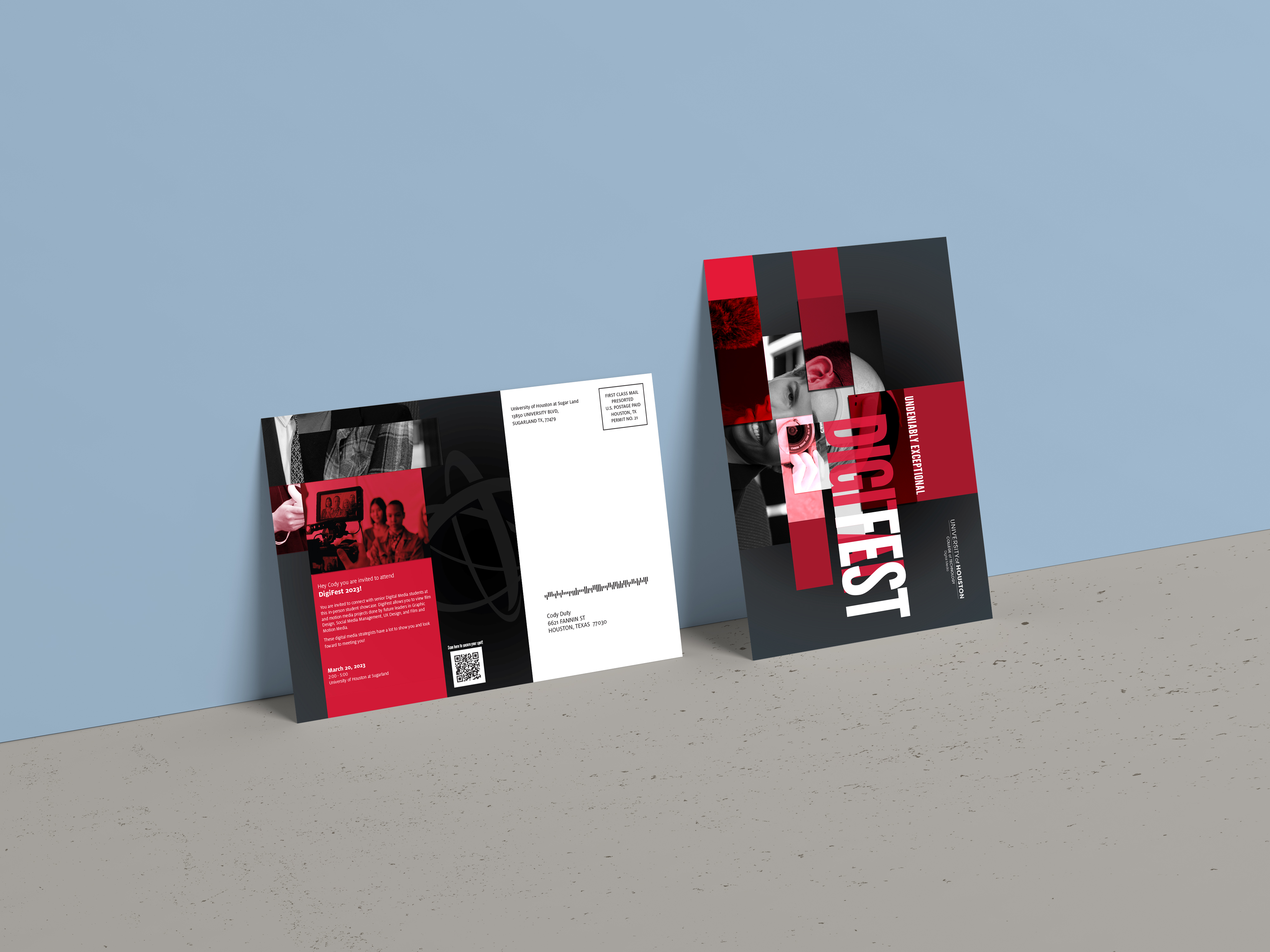


The goal of this project was to re-design a piece of work based on the concepts and techniques of a design movement. "The New York School" established the first significant avant-garde art movement in the United States. Their works spanned from large-scale, expressive compositions to explorations of vast fields of color, focusing on spontaneity, improvisation, and process.
In the wake of World War II, an informal group of artists referred to as “Abstract Expressionists” or “The New York School” introduced the first major avant-garde art movement to develop in the United States. With a focus on spontaneity, improvisation, and process, their works ranged from large-scale, gestural compositions to explorations of open fields of color. Across these works, abstraction was a means of conveying profound expressions of self.
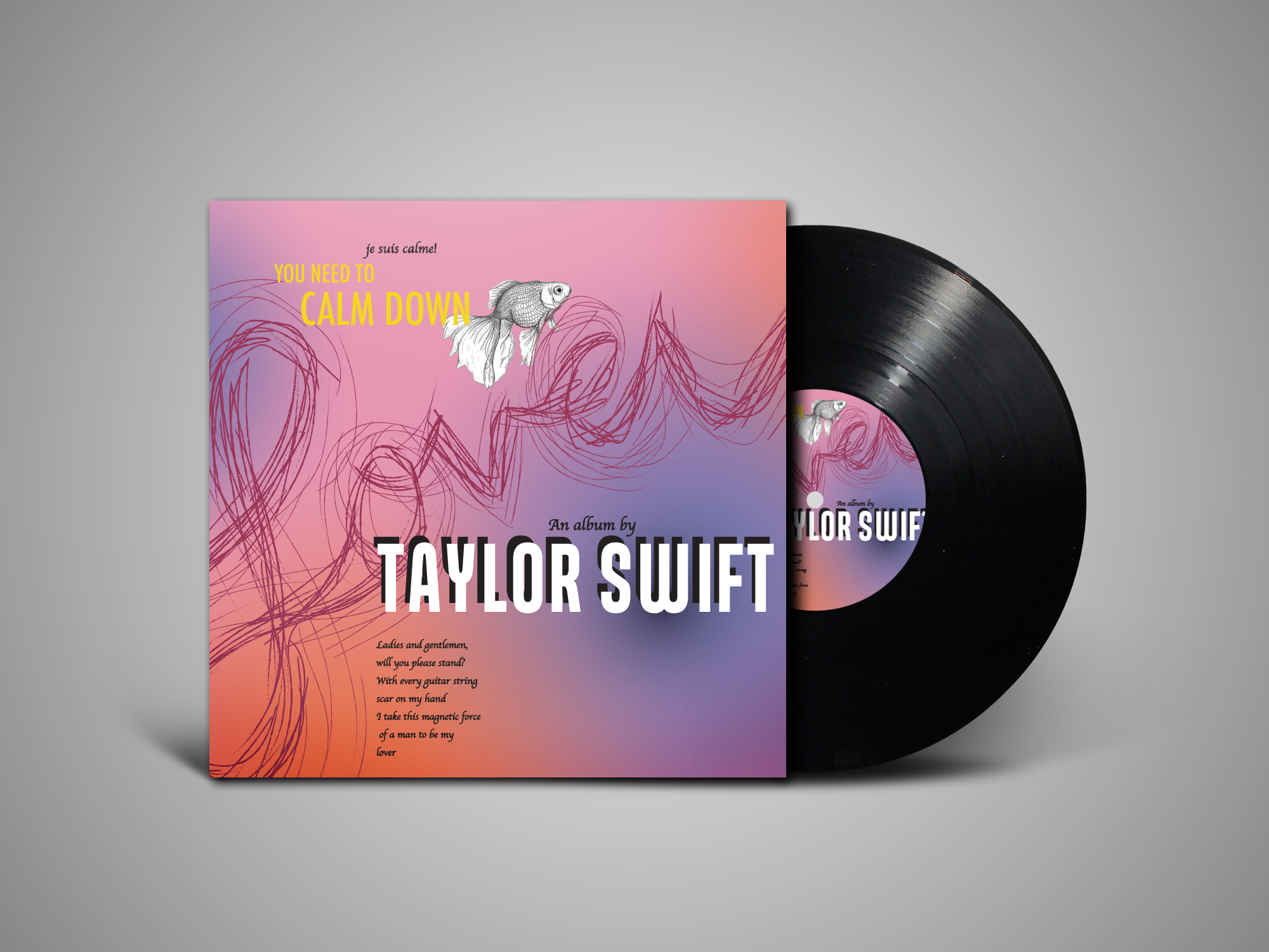
One of the primary reasons for choosing the poster I did was because I felt it related a lot to an album I love so much. After doing more research, I discovered they had much more in common than just the shapes and colors. "The New York School "established the first significant avant-garde art movement in the United States. Their works spanned from large-scale, expressive compositions to explorations of vast fields of color, focusing on spontaneity, improvisation, and process. Abstraction was used to convey profound sentiments of self in all of these works. This movement changed art and design as we know it and introduced colors in a way never used before, which is why I felt like it was a movement I stood by and wanted to contribute to.
I started to use some of the techniques this movement introduced, such as using a bright pink for the background, bright and bold yellow text on the front of the cover, and cutouts ketches that were layered over or behind the texts. After adding all the text ran into a problem where it just seemed too flat. So I made sure to add a few gradients to add depth to the cover and the back to make it have some sort of movement. I wanted to incorporate something my artist (Taylor Swift) is known for: hiding means in the illustrations she provides on her covers. I used a goldfish sketch and a bow and arrow because they both symbolized uncovered meaning that only true fans or the listener of the album would know.